Bottom Navigation in Flutter: Mastery Guide
Bottom navigation has skyrocketed in popularity in the last few years. It came out as an alternative to the not so popular anymore hamburger menus or navigation drawers. Implementing it using Flutter is easy if we want to show the bottom bar only when displaying one of the initial pages, i.e., those directly exposed on the menu.
But that’s not how the cool kids are doing it. Apps like Youtube and Instagram, allows navigation to happen inside tabs, keeping the bottom menu visible for you to shift between them at any time. It also manages separate “navigation stacks” for each, so that they won’t interfere with one another, and allowing you to continue from where you left when you switch back.
In this article, we’ll cover how you can achieve the same. By the end of it, you’ll have a complete understanding of how this works by building a solution that goes incrementally from what you saw in the gif above, to a top-notch solution that even adapts to the device’s platform. I divided that goal into three manageable tasks that we must solve to conquer it. I hope you enjoy it.
README.md 
- I’ll use the terms screen and page interchangeably.
- I’ll use the word flow when referring to a collection of related pages.
- Menu and bar will also be used interchangeably.
-
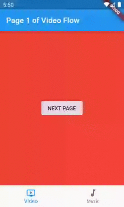
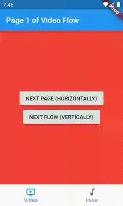
The code sample is available on GitHub, and I’ll reference the branch name whenever useful. You can find the code for the first image at
simple-nav-home-only.
First Task
Showing the bottom menu in other pages besides the initials.
People often refer to this pattern as Instagram-like navigation. It goes like this: instead of one page, we’ll have a stack of pages per tab, enabling us to keep the bar visible while the user navigates inside it.
If we want to present another flow of our app, one that isn’t on the bottom menu, like an authentication flow or merely a fullscreen dialog, we still can/should, but then the bar won’t remain visible.
In summary, for each new page we want to show we have two possibilities:
- Push it inside our current inner stack, i.e., navigating deeper into our flow — horizontal navigation.
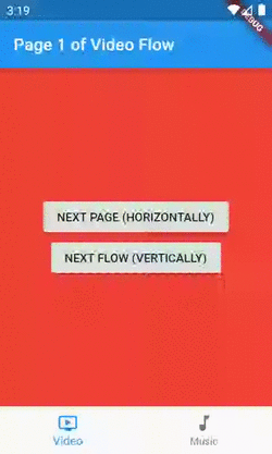
- Push it to our outer/top-level stack, i.e., presenting it as another flow — vertical navigation.
This concept is very familiar to those with an iOS background, as it is standardized over there.
Solution: Having one Navigator widget per tab.
By default, inside our MaterialApp/CupertinoApp, we’re already given a stack to push and pop our pages widgets, but one isn’t enough anymore.
Since in Flutter “everything is a widget”, we need one that is capable of managing its separate stack of pages, so that each of our flows can have one of these. For that purpose, we have the Navigator widget:
A widget that manages a set of child widgets with a stack discipline.
Sounds great, right? If we wrap each flow with one of these, what’s left for us when navigating, is choosing if we want to push the new screen in the current/inner Navigator, for navigating horizontally, or in the MaterialApp/CupertinoApp’s one, for vertical navigation.
“Talk is cheap. Show me the code.”
This class is our entry point, the widget I’m giving to the MaterialApp’s home property. It’s called Screen, not Page, to avoid confusion. Conceptually, this one displays pages inside it rather than being one.
The code for the IndexedPage widget is straightforward and adds nothing to our guide. It’s just a column with two buttons, but you can see it here or by checking out the simple-nav-loosing-state branch. The only part worth mentioning is that when we’re navigating vertically, we should pass true to the rootNavigator parameter of the Navigator.of method.
Second Task
Maintaining state across tab switches.
Our code has a problem now. When we’re navigating through a flow, switch to another, and then come back to the previous, it will be showing its first page again. If this was a real-world app, for example, the user might be filling a form, and wouldn’t be happy to lose it.
Solution: Keeping both tab’s Navigators in the widget tree.
Instead of recreating our flows each time the selected tab changes, this time we want to hold them. We can accomplish that by keeping all in the widget tree, while only displaying one. Here comes the IndexedStack widget:
A Stack that shows a single child from a list of children. The displayed child is the one with the given index.
Kudos to Hans Muller on doing the excellent job of walking us through that.
Here’s the diff from our previous version of the HomeScreen:
       child: Scaffold(
-        body: Navigator(
-          // The key in necessary for two reasons:
-          // 1 - For the framework to understand that we're replacing the
-          // navigator even though its type and location in the tree is
-          // the same. For this isolate purpose a simple ValueKey would fit.
-          // 2 - Being able to access the Navigator's state inside the onWillPop
-          // callback and for emptying its stack when a tab is re-selected.
-          // That is why a GlobalKey is needed instead of a simple ValueKey.
-          key: currentFlow.navigatorKey,
-          // Since this isn't the purpose of this sample, we're not using named
-          // routes. Because of that, the onGenerateRoute callback will be
-          // called only for the initial route.
-          onGenerateRoute: (settings) => MaterialPageRoute(
-            settings: settings,
-            builder: (context) => IndexedPage(
-              index: 1,
-              containingFlowTitle: currentFlow.title,
-              backgroundColor: currentFlow.mainColor,
-            ),
-          ),
+        body: IndexedStack(
+          index: _currentBarIndex,
+          children: appFlows
+              .map(
+                _buildIndexedPageFlow,
+              )
+              .toList(),
         ),
         bottomNavigationBar: BottomNavigationBar(
           currentIndex: _currentBarIndex,
           items: appFlows
               .map(
                 (flow) => BottomNavigationBarItem(
                   title: Text(flow.title),
                   icon: Icon(flow.iconData),
                 ),
               )
               .toList(),
           onTap: (newIndex) => setState(
             () {
               if (_currentBarIndex != newIndex) {
                 _currentBarIndex = newIndex;
               } else {
                 // If the user is re-selecting the tab, the common
                 // behavior is to empty the stack.
                 currentFlow.navigatorKey.currentState
                     .popUntil((route) => route.isFirst);
               }
             },
           ),
         ),
       ),
     );
   }
+
+  // The best practice here would be to extract this to another Widget,
+  // however, moving it to a separate class would only harm the
+  // readability of our guide.
+  Widget _buildIndexedPageFlow(AppFlow appFlow) => Navigator(
+        // The key enables us to access the Navigator's state inside the
+        // onWillPop callback and for emptying its stack when a tab is
+        // re-selected. That is why a GlobalKey is needed instead of
+        // a simpler ValueKey.
+        key: appFlow.navigatorKey,
+        // Since this isn't the purpose of this sample, we're not using named
+        // routes. Because of that, the onGenerateRoute callback will be
+        // called only for the initial route.
+        onGenerateRoute: (settings) => MaterialPageRoute(
+          settings: settings,
+          builder: (context) => IndexedPage(
+            index: 1,
+            containingFlowTitle: appFlow.title,
+            backgroundColor: appFlow.mainColor,
+          ),
+        ),
+      );
 }
That’s enough for preventing our stack of pages from being emptied each time we switch tabs. You can find this version at the stateful_nav_material branch.
Third Task
Make it look like iOS’ and Android’s native bottom navigation components.


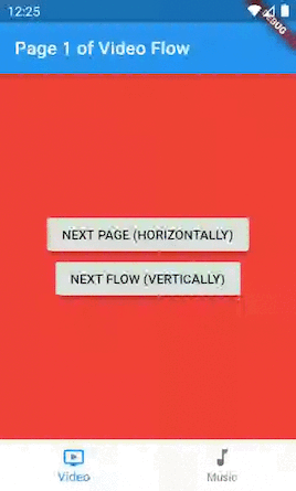
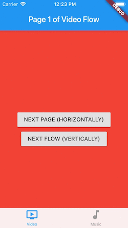
I took both screenshots from the final version of our app. Notice that on the Cupertino’s, there is no splash effect on selection, the icons are bigger and the titles smaller. Of course, that’s only a concern if you want your app to look exactly like the natives.
Solution: Building a platform-aware widget.
We use the term platform-aware, or simply adaptive, when referring to widgets that render differently depending on the device’s platform.
The good news is that the equivalent Cupertino’s widgets for what we’ve done so far, already handles by default tasks one and two for us.
If we were to close our eyes to the third task, we would have two paths to follow:
- Use our current implementation on both platforms, the downside being that it looks like Android’s native component.
- Use the
CupertinoTabScaffoldwidget on both platforms, the downside being that now it looks like the iOS’ native component.
But, as the great developers that we all are, we won’t ignore the third task. I promised you a top-notch solution, and that’s what you’ll get. 
Step-by-step on becoming adaptive
- In our
IndexedPage, we’re pushing routes using theMaterialPageRouteclass. Let’s make it more professional by using aCupertinoPageRoutewhen we’re on iOS:
void _pushPage(BuildContext context, bool isHorizontalNavigation) {
    // If it's not horizontal navigation,
    // we should use the rootNavigator.
    Navigator.of(context, rootNavigator: !isHorizontalNavigation).push(
-      MaterialPageRoute(
+      _buildAdaptivePageRoute(
        builder: (context) => IndexedPage(
          // If it's a new flow, the displayed index should be 1 again.
          index: isHorizontalNavigation ? index + 1 : 1,
          // If it's a new flow, we'll randomize its color.
          backgroundColor: isHorizontalNavigation
              ? backgroundColor
              : Colors.primaries[Random().nextInt(Colors.primaries.length)],
          // If it's starting a new flow let's just call it 'New.'
          containingFlowTitle:
              isHorizontalNavigation ? containingFlowTitle : 'New',
        ),
        fullscreenDialog: !isHorizontalNavigation,
      ),
    );
  }
+
+  PageRoute<T> _buildAdaptivePageRoute<T>(
+          {@required WidgetBuilder builder, bool fullscreenDialog = false}) =>
+      Platform.isAndroid
+          ? MaterialPageRoute(
+              builder: builder,
+              fullscreenDialog: fullscreenDialog,
+            )
+          : CupertinoPageRoute(
+              builder: builder,
+              fullscreenDialog: fullscreenDialog,
+            );
That will handle the different transition animations between platforms for us.
- Fortunately, both the Material’s solution we built and the Cupertino’s widgets composition for achieving the same (we’ll get there) uses the same
BottomNavigationBarItemclass for representing the tabs, aGlobalKeyfor its inner navigators, and both needs a builder for the initial page of each flow. So, I’ve created a wrapper class in a separate file for these dependencies:
- Let’s move our Material’s specific code out of the
HomeScreenand into another widget calledMaterialBottomNavigationScaffold. Notice that it knows nothing about the domain of our app (music and videos).
- Create the
Cupertino’s analogous to our recently createdMaterialBottomNavigationScaffold. These are all classes brought to us by theCupertinolibrary, and since it already handles by default tasks one and two for us, the code is self-explanatory.
- Create a Scaffold class that chooses between our Material’s and Cupertino’s and also implements the common behavior to both.
- Change the
HomeScreento use our newly bornAdaptiveBottomNavigationScaffoldand keep only our domain specifics.
And you’re done! This complete version is available at the adaptive-stateful-nav branch.
Notice that although we made our bottom navigation bar and route transition animations look different on each platform, our IndexedPage doesn’t. That’s why we still have this Material feel on our buttons and app bars, but let’s leave this for another article.
Recap
We started with the simplest possible solution, where the bottom menu was visible only when showing the initial pages, then solved that by having multiple Navigators. Next, we identified that we were losing state, so we used an IndexedStack for helping us with that. Last but not least, we gave it different looks on each platform by building Material’s and Cupertino’s versions and choosing between them based on the platform we’re currently running. It may seem like a lot, but now you have a full-fledged solution to use in every production project you need to.
Bonus
Check out the master branch to see how I added cross-fade transitions and lazy widget building to MaterialBottomNavigationScaffold as taught by Hans Muller’s article.
There is no need to apply those to CupertinoBottomNavigationScaffold, since the lazy building is how it already works and the animation is a recommendation of the Material Design’s specification.